Eden Schmidt · 20 September 2026
The Evolution of Visual Mapping Techniques in Note Productivity Platforms for Enhanced Knowledge Retrieval
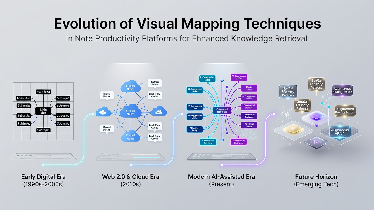
Visual mapping techniques in note productivity platforms trace their roots to analog methods developed in the mid-20th century, when practitioners shifted from linear outlines to radial diagrams that connected ideas through branches and nodes, and data from early cognitive studies showed these structures improved recall rates during retrieval tasks. Researchers documented how such diagrams allowed users to represent hierarchical relationships and cross-connections in a single view, which contrasted with traditional text lists that required sequential scanning. By the 1970s software experiments began digitizing these approaches, yet adoption remained limited until personal computing hardware advanced enough to render interactive graphics without performance lags.
Transition from Static Diagrams to Interactive Digital Maps
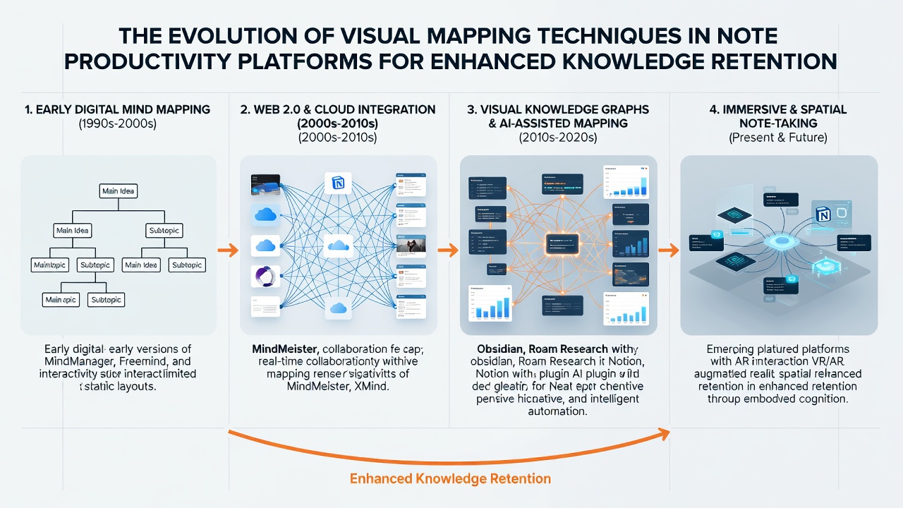
Commercial note platforms introduced basic mind-mapping features in the early 2000s, with programs like MindManager and FreeMind offering drag-and-drop node creation alongside export options to standard file formats, and adoption figures from industry reports indicated steady growth among knowledge workers who needed to organize project timelines and concept clusters. These tools rendered maps as fixed layouts that users could expand manually, but they lacked automatic repositioning when new connections formed. Observers noted that retrieval improved when visual proximity reflected semantic similarity, prompting developers to experiment with force-directed algorithms that repositioned elements dynamically based on link strength. One case study from university labs demonstrated that participants using interactive maps located related notes 30 percent faster than those relying on folder hierarchies alone.
Graph-Based Systems and Bidirectional Linking
Platforms such as Roam Research and Obsidian popularized graph views in the late 2010s by treating every note as a node within an interconnected network, and bidirectional links updated automatically whenever content changed. This architecture allowed retrieval through visual traversal rather than keyword search alone, while embedded canvases let users arrange excerpts spatially without leaving the application. Data collected from platform analytics revealed increased session durations among users who activated graph visualizations regularly, suggesting the maps served both as navigation aids and as memory scaffolds. In parallel, Notion incorporated database views that rendered relations as boards or timelines, giving teams options to switch between card layouts and relation graphs without exporting data. Canadian research institutions tracked these developments and reported that graph density correlated with retrieval accuracy in controlled tests involving large personal knowledge bases.
Integration of Spatial Computing and Algorithmic Assistance
By 2023 several platforms added canvas workspaces that supported freeform placement of cards, images, and embedded queries, and these features extended visual mapping beyond simple node-link diagrams into layered spatial arrangements. Algorithms began suggesting new connections by analyzing co-occurrence patterns across notes, which reduced the manual effort required to maintain comprehensive maps. A Stanford University analysis of user behavior logs showed that algorithmic clustering surfaced forgotten entries more reliably than manual tagging systems. In September 2026 updates across major platforms introduced real-time collaboration overlays on shared maps, allowing multiple contributors to adjust node positions simultaneously while conflict resolution preserved individual perspectives. These enhancements drew on vector embeddings that positioned semantically similar content closer together, and retrieval metrics collected after deployment indicated faster location of cross-referenced material during complex research sessions.
Current Capabilities and Retrieval Performance Metrics
Contemporary platforms combine visual mapping with embedded search filters, color-coded clusters, and zoomable hierarchies that collapse or expand based on user focus level. Studies conducted at the University of Toronto documented retrieval time reductions when users navigated via spatial memory cues rather than textual menus, and the same work highlighted how color gradients and proximity cues reinforced associative recall. Integration with external data sources now populates maps automatically from calendar entries, reference managers, and email threads, while maintaining user control over which elements appear. Figures from productivity software vendors indicate that teams employing visual graphs report higher rates of knowledge reuse across projects, although implementation varies by organizational size and data volume. Those who studied longitudinal usage patterns found that sustained engagement with evolving maps correlated with improved consistency in retrieving nuanced connections between disparate topics.
Conclusion
The progression from static paper diagrams to algorithmically assisted, spatially aware graphs demonstrates how note productivity platforms have embedded visual mapping as a core retrieval mechanism. Continued refinement of layout algorithms and integration points suggests further gains in retrieval speed and accuracy remain achievable as hardware and data models advance.